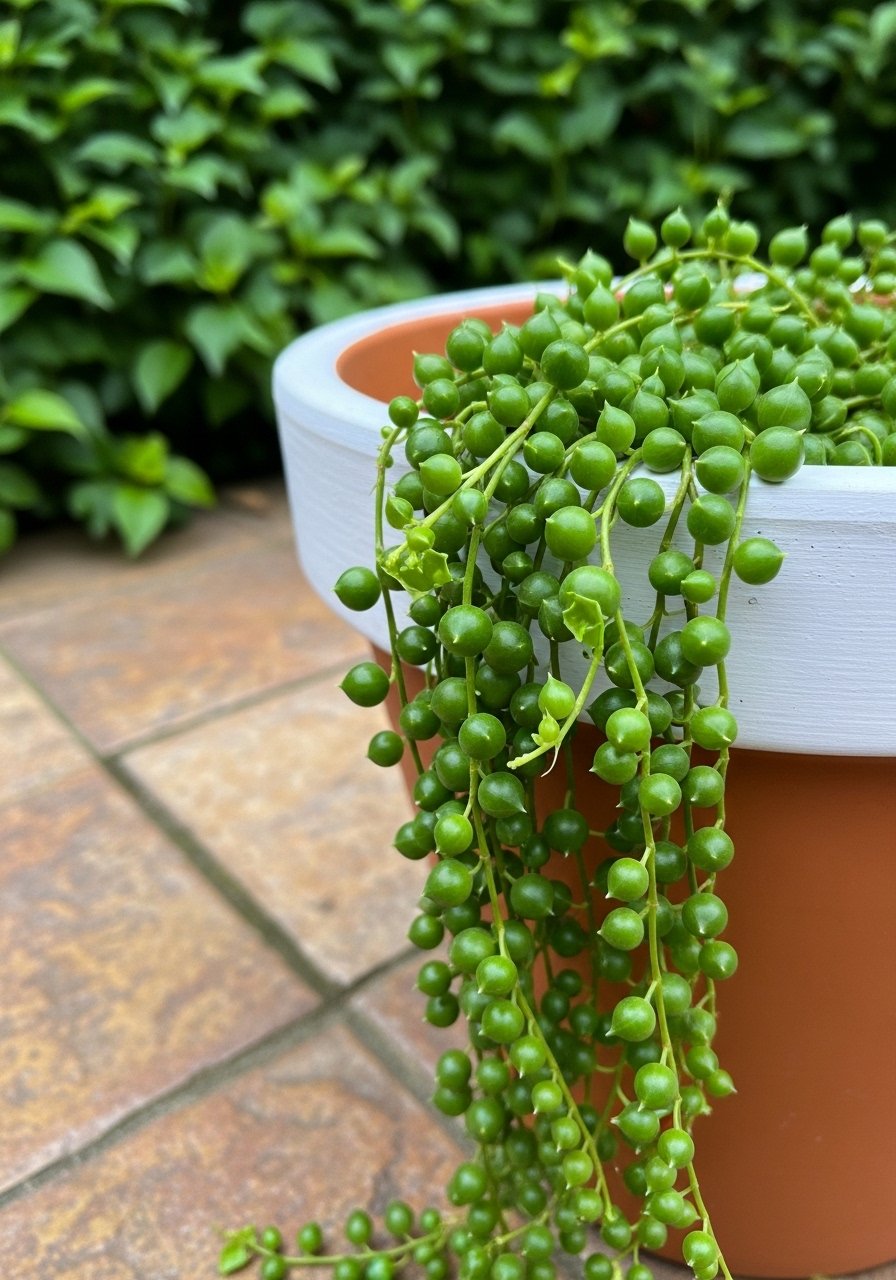
I’d been staring at the same chipped pots for years. They planted well, but the colors read cold against my warm shrubs. I didn’t want perfect craft. I wanted pots that read like they belong.
This guide shows how I paint and place pots so they feel purposeful. It’s simple, doable, and makes the whole bed read cleaner.
How To Paint Outdoor Flower Pots For A Fresh Custom Look
This is the method I use when pots look like afterthoughts. You’ll learn how to choose a color story, make the finish sit with foliage, and arrange painted pots so the garden reads balanced and intentional.
What You’ll Need
- Outdoor acrylic paint (assorted 8 oz tubes)
- Exterior matte spray sealer (11 oz)
- Painter’s tape 3/4 inch (roll)
- Foam paint brush set (2-pack, medium)
- Plastic drop cloth 9×12 ft
- Small sanding block (medium grit)
- Chalk paint marker pack (assorted colors)
Step 1: Choose a color story that ties to the garden
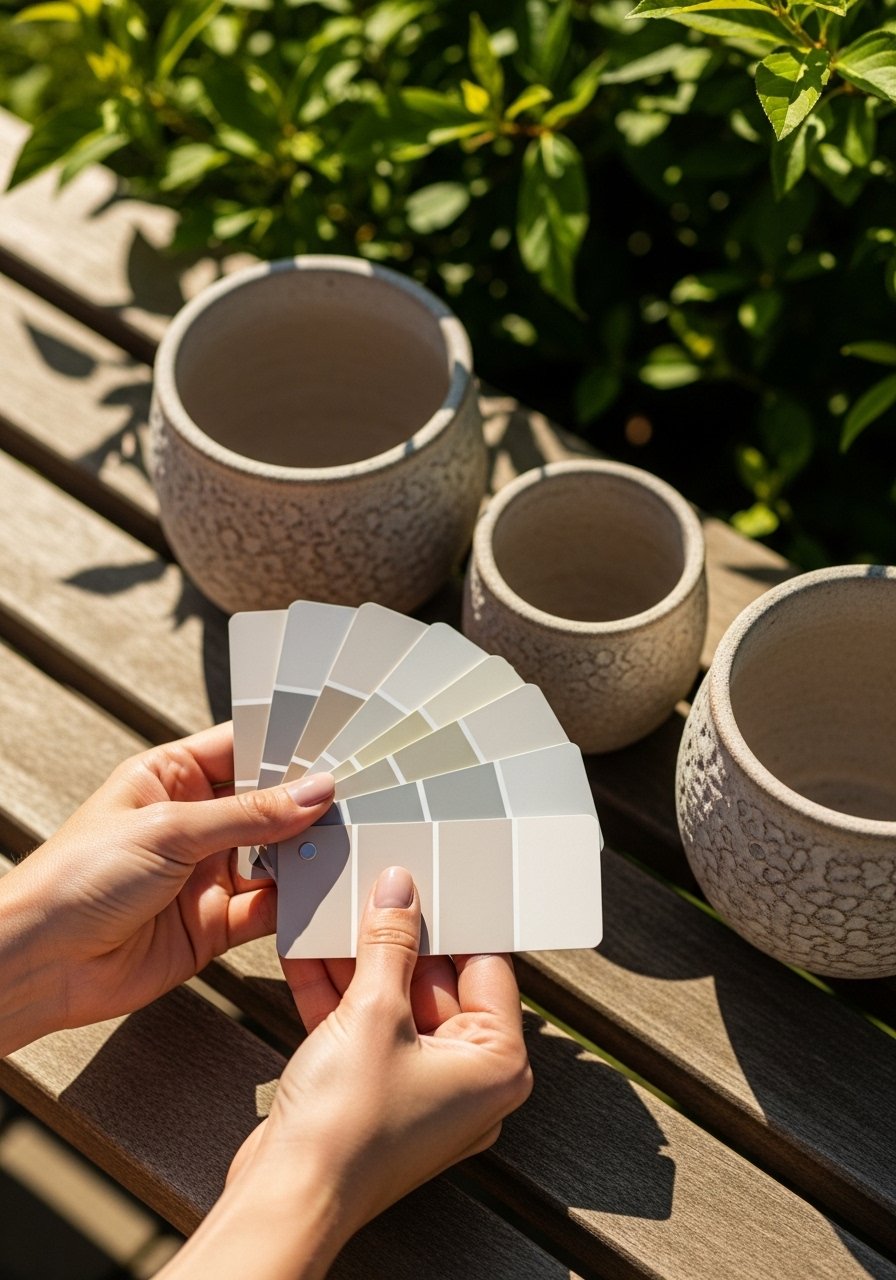
I start by looking at the plants first. I pick one dominant plant color and one neutral. That gives me a base and a highlight. Choosing colors from the bed keeps pots feeling like part of the scene, not a separate decoration.
People often pick every color they like. That creates visual noise. Avoid using more than two active colors on a small patio unless you want a busy look.
Step 2: Match finish and scale to the bed
I think about finish—matte sits behind foliage, glossy pops. For large pots I use a subtler base so plants stay the star. Small pots can take a brighter accent or a rim color.
The insight many miss is posture: scale changes how bold a finish reads. One mistake is making every pot glossy; it fights with natural textures and reads less homey.
Step 3: Paint with intent so the surface feels lived-in
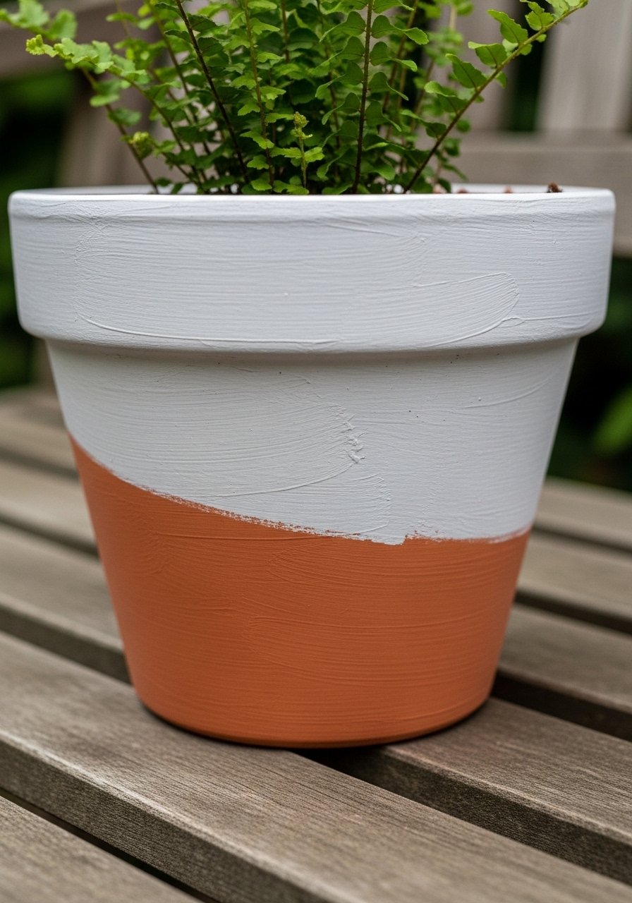
When I paint, I imagine the pot in its final spot. I let brush marks read a little handmade. It keeps things comfortable. Choosing where to leave texture helps the pot feel like part of the plot instead of a showroom piece.
People overthink patterns. A too-precise motif can look staged. Avoid painting overly complex designs on every pot—too much detail competes with the plants.
Step 4: Use small accents to create cohesion
I add small accents: rims, a single stripe, or a painted base. Those tiny touches echo color across a group and pull the eye. They’re what make scattered pots feel like a set.
The insight most skip is restraint. One thin stripe repeated on three pots reads cohesive. A common mistake is varying accent styles on every pot—it fragments the composition.
Step 5: Edit placement for balance and flow
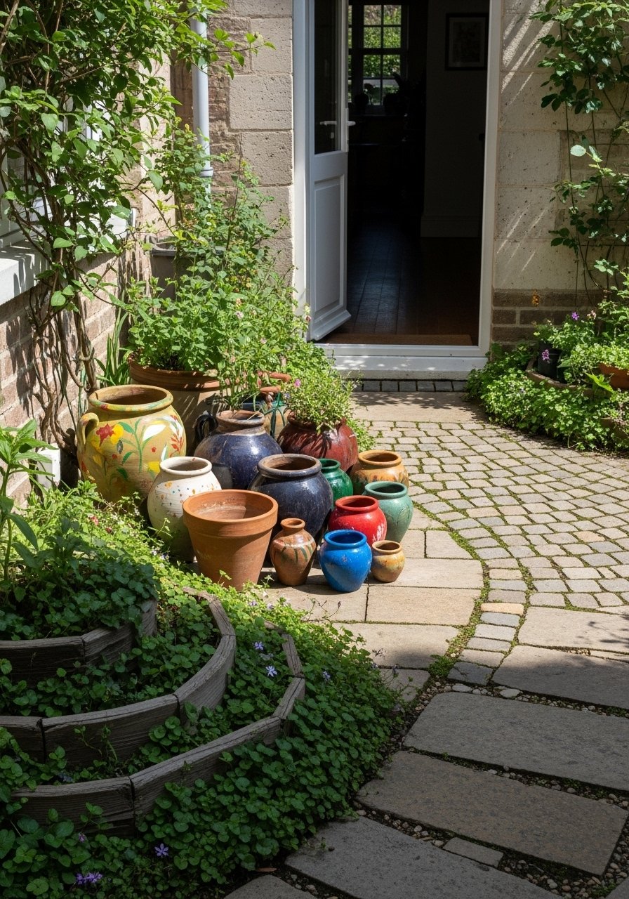
I always step back and view from the house and path. I move taller pots to anchor corners and low pots to soften edges. Grouping in odd numbers usually helps the eye rest.
People tend to cluster everything together. That can look cluttered. Don’t crowd—leave breathing space so each painted surface can read against the plants.
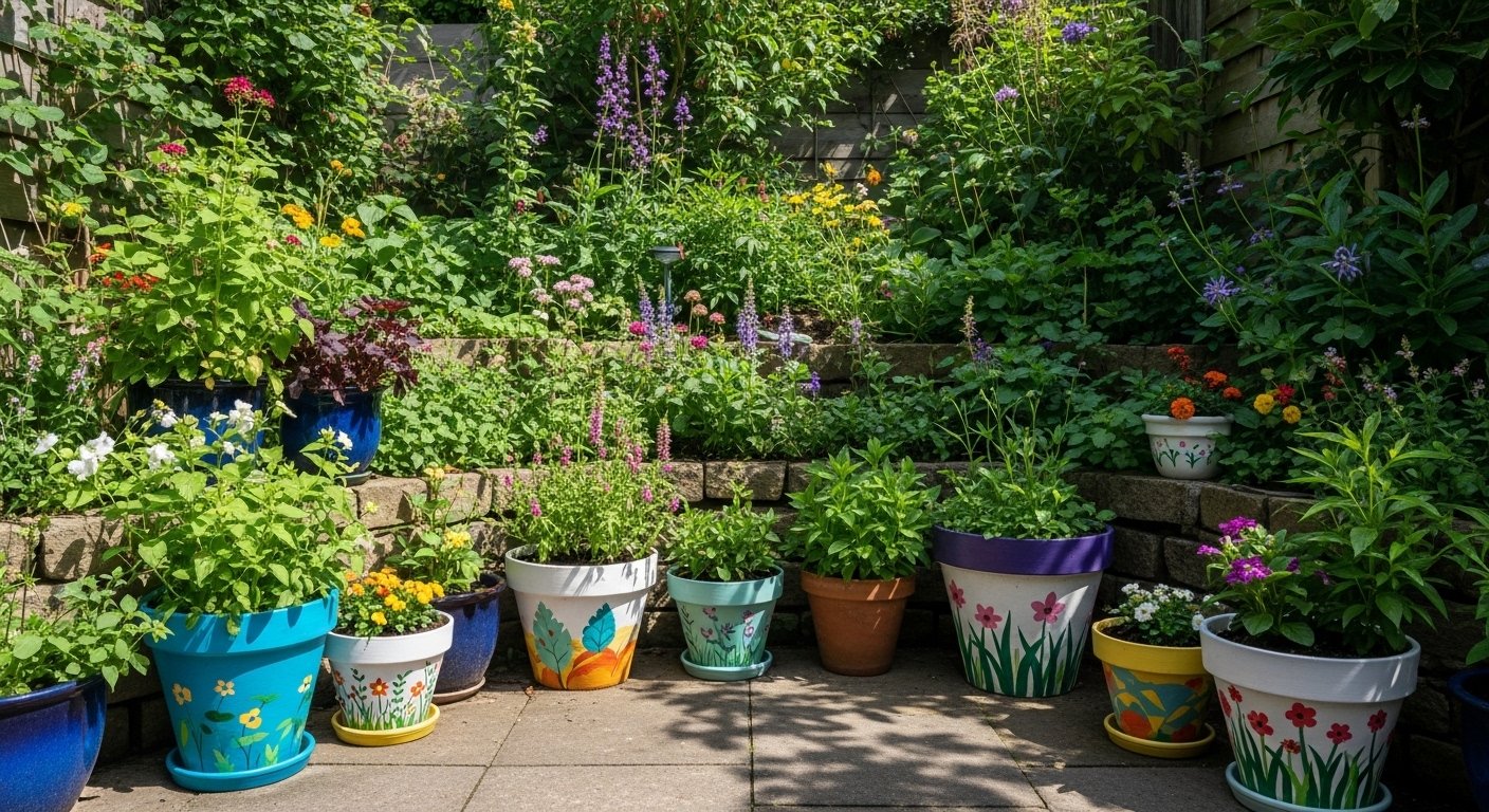
Color Choices That Work
I favor muted, warm bases like dusty terracotta, soft olive, or warm gray. They sit quietly with most foliage. Then I add one pop: a rim or a stripe in a saturated tone.
If your garden has strong flower colors, pick a base from the leaf tones instead. That keeps pots as a frame, not a competitor. Small palettes read more intentional than many separate hues.
Placement & Grouping Tips
Place a statement pot at a sightline—by the door or at the end of a path. Use two small pots to flank a step or one taller pot to anchor an empty corner. Odd-number groupings feel calm.
Try mixing heights and textures. Pair a smooth painted pot with a textured clay one. The contrast makes the painted finish feel deliberate and lived-in.
Maintenance & Longevity
I seal painted pots with a matte sealer for weather resistance. That keeps colors steady without adding shine. I touch up scuffed rims in spring after the heavy weather.
If a pot chips, I repaint the section and let it weather a season—an imperfect fix often looks natural. Avoid redoing the whole set every year; small edits keep the collection feeling familiar.
Final Thoughts
Start with one pot if you’re unsure. Paint it to match a plant or a doorway. Live with it for a month.
You’ll learn how colors sit in your light. Small changes make the bed read more intentional.
Go slowly. Editing matters more than perfect painting.
Leave a Reply